The Psychology of Color and Its Effect on Mindfulness at Work
Learn how color influences your focus, calm, and presence at work—and how to design a mindful workspace that supports your mental clarity.

Is your workspace subtly sabotaging your focus? You might blame stress or poor sleep, but the real culprit could be right in front of you—color.
The hues on your walls, screen, and desk aren’t just decoration. They influence your mood, energy, and mental clarity more than you think.
If you're striving for a calmer, more present workday, it's time to understand how color shapes your mind—and how to make it work for you.
How Color Interacts with the Brain
Color isn’t neutral. Your brain processes it like data—visually, emotionally, and physiologically. It lights up your nervous system and influences how you feel, think, and even perform. This isn’t artistic theory. It’s neuroscience.
Let’s break it down. Visual input travels through the optic nerve into the brain’s visual cortex, where it intersects with emotional centers like the amygdala and the hypothalamus.
These areas regulate mood, alertness, and physiological responses like heart rate and breathing. Color, in short, changes how your body behaves.
Blue is a prime example. It’s been shown to slow heart rate, reduce blood pressure, and promote a sense of calm.
Not just “peaceful”—blue also supports sustained attention and cognitive endurance. That’s why it’s often used in open offices and task-heavy environments.
Red, by contrast, increases physiological arousal. It heightens alertness and sharpens detail-oriented thinking, which can be useful in deadline-driven or competitive contexts.
But prolonged exposure? It’s draining. Your nervous system interprets red as a cue for action—or danger—and ramps up accordingly.
Green offers balance. It sits at the center of the visible spectrum, and studies suggest it promotes a sense of harmony and equilibrium.
People report feeling more centered in green environments, which aligns with findings from environmental psychology: green spaces—natural or artificial—reduce stress and improve mental recovery.
Yellow can energize, stimulate creative thinking, and spark optimism. But it’s also the most fatiguing color to look at over time.
Our eyes strain more in yellow-heavy spaces, which can cause irritability or restlessness if the tone is too harsh or the lighting too bright.
In a well-known 2009 study published in Science, researchers Mehta and Zhu explored how color impacts cognitive performance. Participants completed tasks involving either attention to detail or creativity.
When surrounded by red, they excelled at detailed work. Under blue, their creative output significantly improved. Color didn’t just affect mood—it altered how people thought.
Why Mindfulness Is a Visual Practice
Mindfulness is often treated as something you “do”—a breathing exercise, a quiet break, a five-minute meditation. But that’s a narrow view. Mindfulness is also about how you relate to the present moment—and that includes your environment.
If your workspace constantly triggers stress responses, you’ll spend your energy managing distractions rather than being fully present. And that’s where color becomes strategic. It’s not just aesthetics. It’s alignment.
Colors that support mindfulness act like visual cues for the brain to slow down, settle, and stay. They reduce internal friction, helping you access that elusive flow state where you're alert but calm, focused yet relaxed.
When you enter a workspace bathed in soft tones—muted blues, dusky greens, earthy neutrals—your nervous system doesn’t have to work as hard to feel safe.
You’re not subconsciously scanning for threats or novelty. Your attention becomes more stable.
But when you're surrounded by stark whites, bright fluorescents, or bold primary tones, your brain stays in a low-grade state of vigilance.
Even if you're not consciously bothered, your body stays slightly tensed. That tension translates into fatigue, distraction, and mental drift. Mindfulness isn’t just internal discipline—it’s external design.
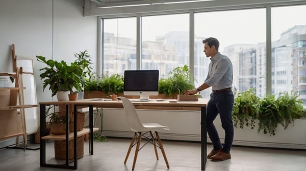
Shaping Your Space: Subtle Tweaks, Big Shifts
You don’t need to repaint the office or invest in custom furniture. Mindfulness starts at arm’s reach—what you see when you look up from your screen or down at your desk.
Start with your workspace palette. This includes more than walls—it’s everything in your visual field: desktop background, notebooks, sticky notes, mugs, folders, even the tone of your lighting.
Need more grounding? Bring in cooler shades—soft blues, sage greens, charcoal accents. These visually echo the kinds of environments we evolved in: water, sky, shaded trees. Your brain recognizes them as safe zones.
Feeling drained? A hint of warm color—terracotta, burnt orange, or mustard—can offer a dose of energy without tipping into overstimulation. These shades work best as accents: a pen holder, cushion, or plant pot.
Need to reset your focus mid-day? Add earthy textures and tones like wood grain, stone, or natural fabrics. These engage the senses more deeply than flat, synthetic surfaces. Visual mindfulness is also tactile.
Importantly, color is personal. Some people find purple calming; others find it heavy. Your cultural background, memory associations, and even time of day influence your reactions. So treat this as a creative experiment, not a checklist.
Ask yourself: What colors make me feel like I can breathe? What colors push me into urgency or agitation? Use that data.
Digital Mindfulness Starts with Visual Hygiene
Your screen is your real office. Most professionals spend more time looking at pixels than physical objects—so digital color matters.
Switching to dark mode does more than reduce glare. It lowers your cognitive load, especially in the afternoon when mental fatigue builds.
High-contrast white backgrounds can keep your brain buzzing, while softer tones allow for better visual rest.
A desktop wallpaper featuring a quiet forest, ocean horizon, or abstract art in calming tones can act as a tiny mindfulness moment every time you minimize a window.
Decluttering your icons, grouping folders by color or theme, or adjusting app interfaces can dramatically shift how your digital space feels. Your goal isn’t minimalism—it’s coherence. A sense of visual order reduces decision fatigue.
Even your notification colors can impact your stress levels. Red badges scream urgency, even when the content isn’t critical. Consider changing them to muted hues or disabling them altogether. Small decisions. Massive return.
Offices That Understand the Assignment
Some companies are ahead of the curve, leveraging color as part of broader wellness and productivity strategies.
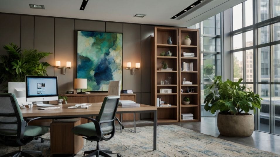
In biophilic design—a movement that integrates natural elements into built environments—color is used to recreate the rhythms and tones of nature.
Think moss walls, sky-toned ceilings, leafy plant arrangements, wood-paneled quiet rooms. These aren’t luxuries. They’re tools for attention management.
The University of Texas study on color in office environments found that workers in white, grey, and beige spaces reported more sadness, fatigue, and burnout.
Women in particular were more negatively affected by stark, desaturated palettes. In contrast, spaces with warmer, varied, and softer colors saw higher levels of employee satisfaction and engagement.
Design psychology is no longer optional. It's becoming a baseline for high-performing, human-centered workplaces.
Final Thoughts: Start Now
Your environment is always working on your brain. Every wall, screen, and surface sends signals. They can either anchor you or agitate you. Guide you into presence or pull you into distraction.
Color is one of the simplest, most cost-effective ways to reshape your space for mindfulness. You don’t need permission. You don’t need a new role. You need awareness—and a willingness to experiment.
So start small. One item. One change. A soft green journal. A foggy-blue background. A clay-colored mug. Then watch what shifts. Because the path to mindful work isn’t paved with apps and habits—it starts with what you see.